
BEFORE & AFTER / LOGO DESIGN
CUSTOMER: Myogen, Inc.
PROJECT DETAILS:
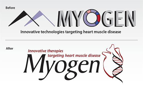
Myogen was a biopharmaceutical company focused on the development of small molecule therapeutics for the treatment of serious, debilitating cardiovascular disorders. The original logo developed in-house used a less understood scientific symbol for “genetic markers” in the DNA code that looked more like flags and a mountain shape to the average viewer.
I was hired to redesign the logo and to help create an executive-level Powerpoint presentation to secure more financial investors. I started with the more universally recognized DNA double-helix symbol. I then utilized the calligraphic-like strokes of the DNA to playfully but accurate create a representation of a human heart. That way the two symbols were tied together visually, stylistically.
Myogen was eventually bought for $2.5 billion cash by Gilead Sciences Inc.


