
LOGO DESIGN
CUSTOMER: Myogen, Inc.
CATEGORY: BEFORE & AFTER
PROJECT DETAILS:
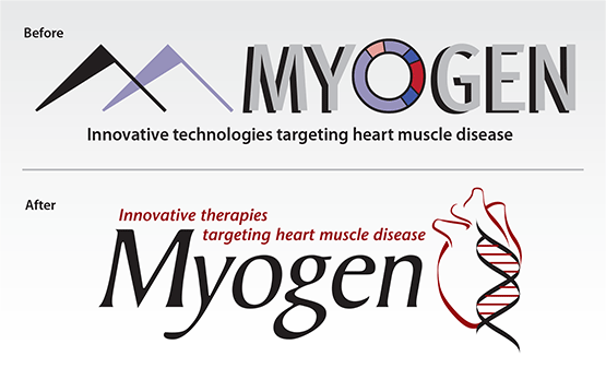
The earlier Myogen logo uses common symbols from molecular biology (i.e., the “O” circle gene-vector indicator, but the meaning is obscure to most non-scientists). With a need to change emphasis from science to securing investment partners, the redesign uses the more readily recognized symbols of the DNA double-helix and a human heart to quickly identify Myogen as a developer of cardiac gene therapies. The calligraphic-like strokes of the helix where used as elements to create stylized but accurate heart representation. The tagline “Innovative therapies targeting heart muscle disease” and the visual symbology both add clarity to the message in their own unique way.


