“BEST OF CATEGORY — TYPOGRAPHY 2012”
— American Corporate Identity – ADGA Annual Awards
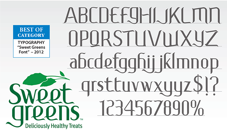
CUSTOMER: Sweet Greens Treats, Boulder, CO
Project details:
Initially I was to design the logo for Sweet Greens Delicious Healthy Treats. This small bakers created cookies and brownies that include green vegetables like roasted kale and broccoli in the mix. I could not locate a font that I liked anywhere. So I began to experiment with my own design starting with the lowercase “e” first, since I had 4 of them right in the middle of the design. Once happy with that, I built out the rest of the characters and later the rest of the font.